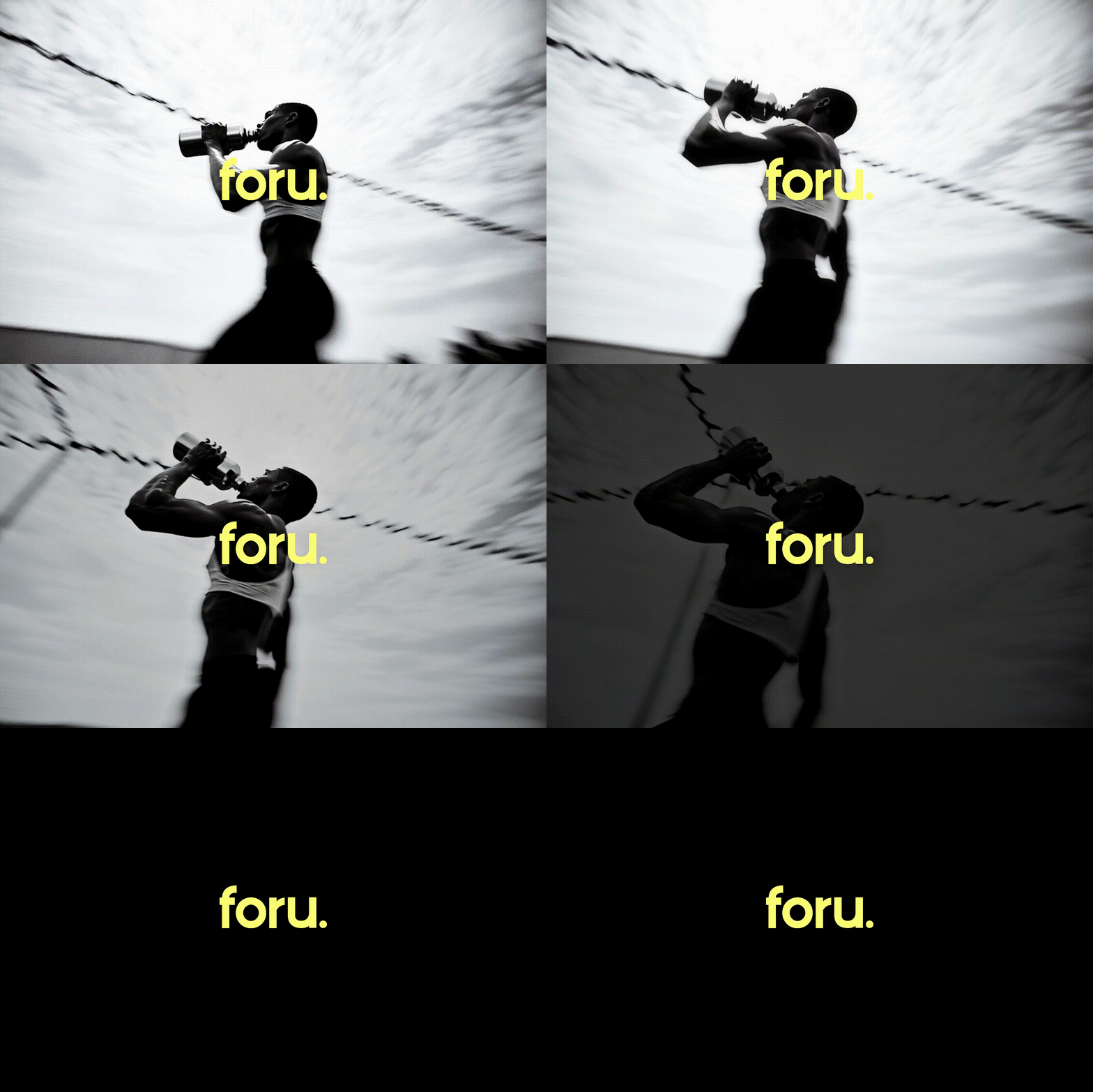
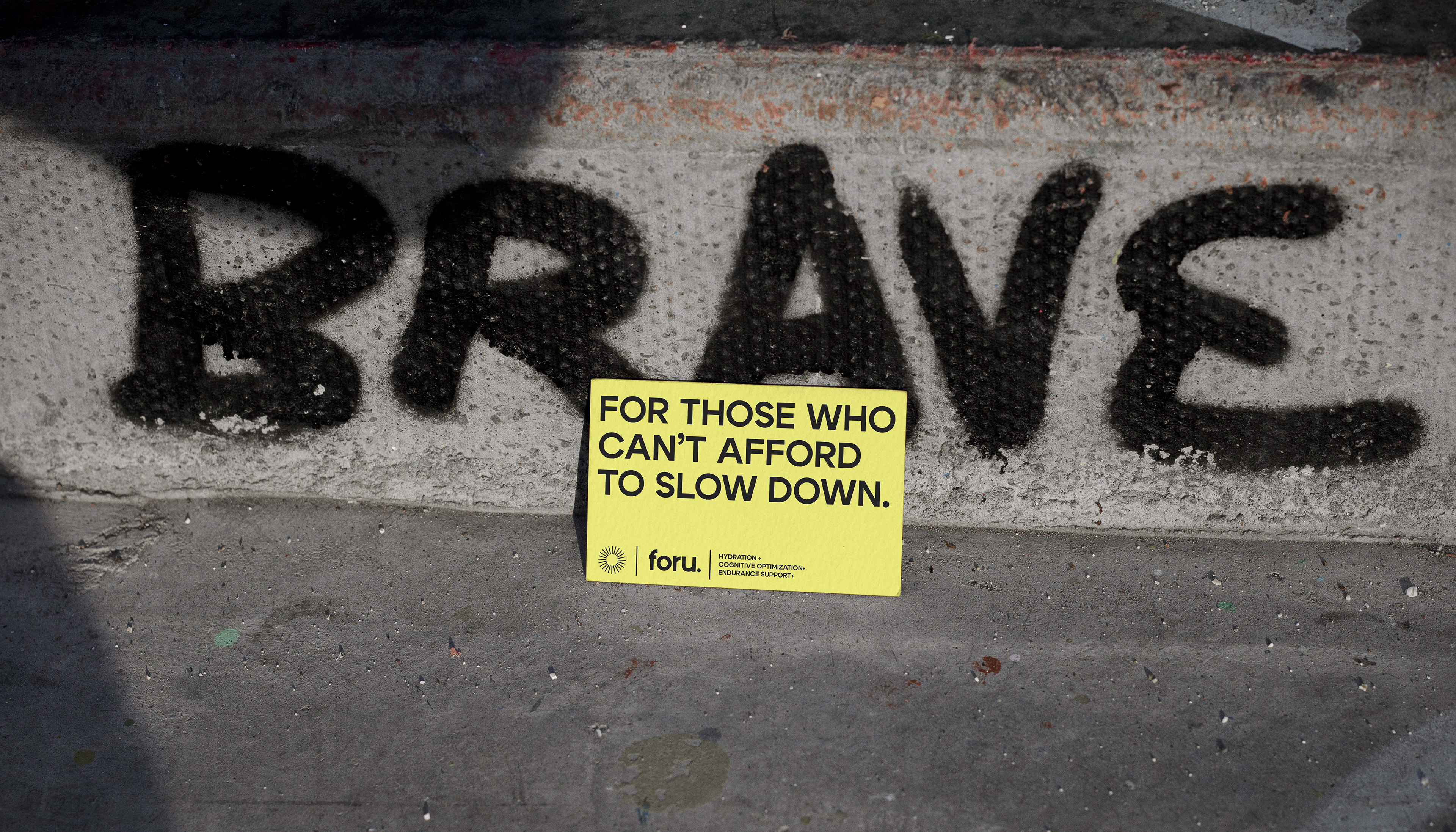
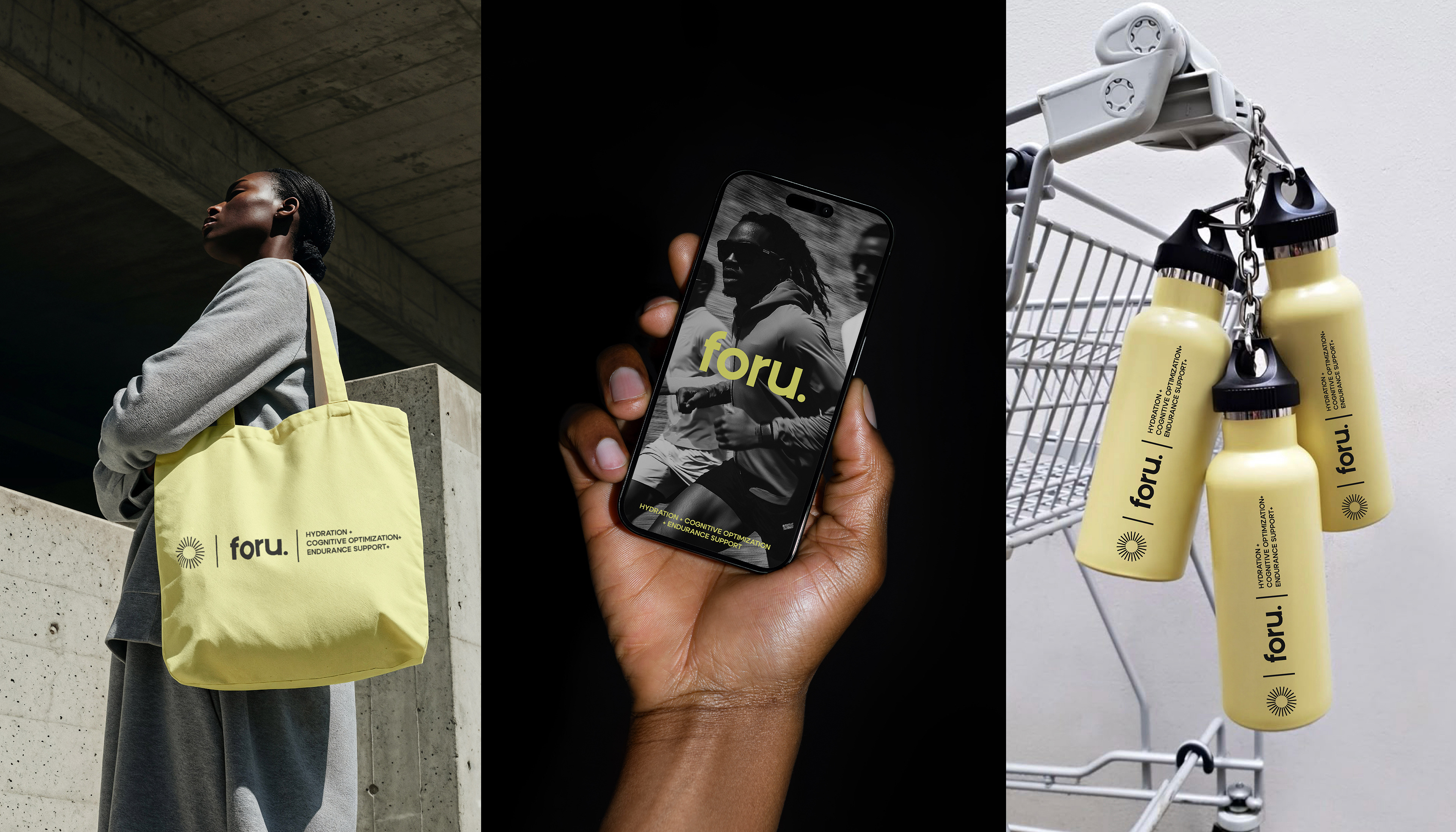
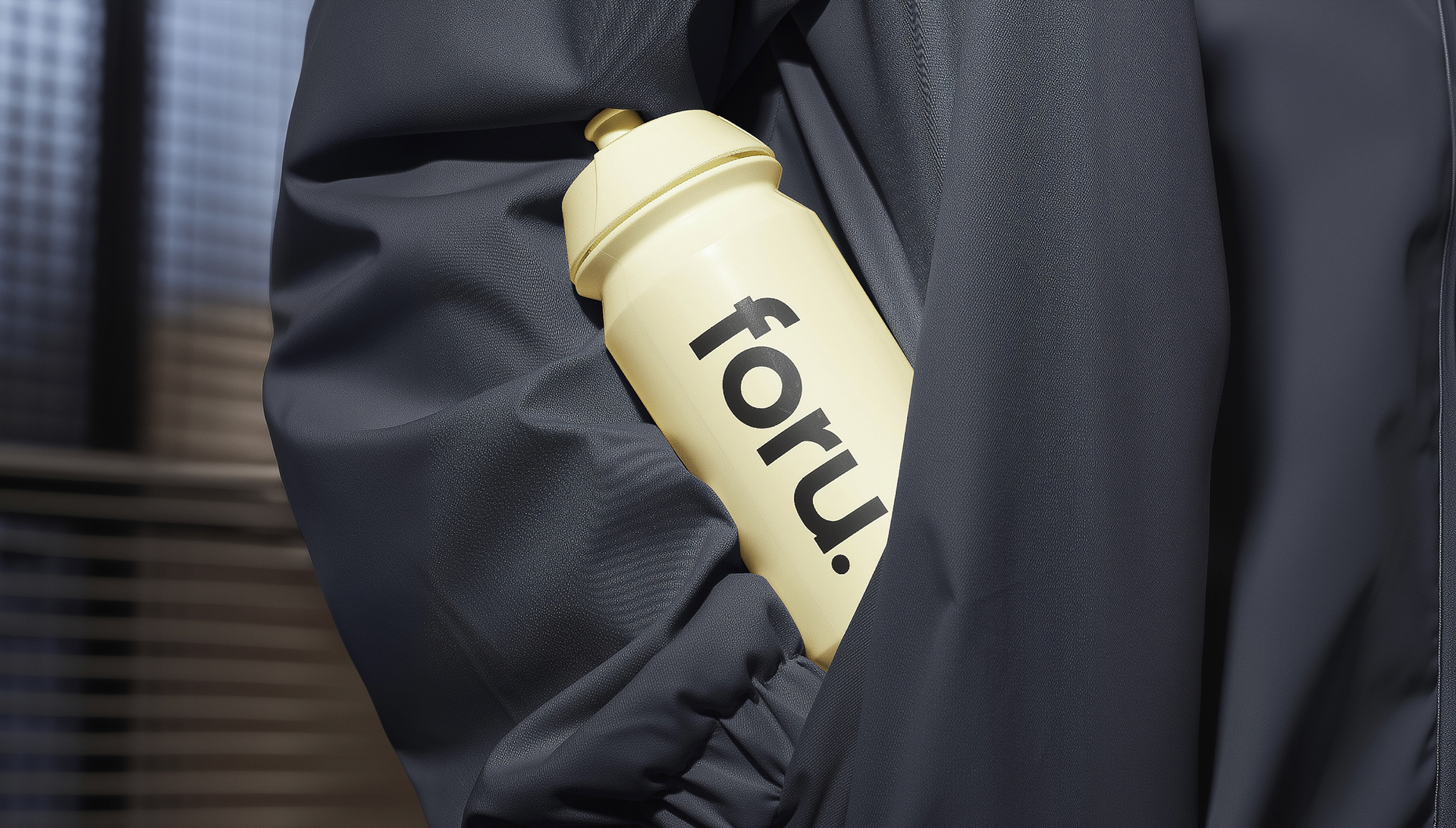
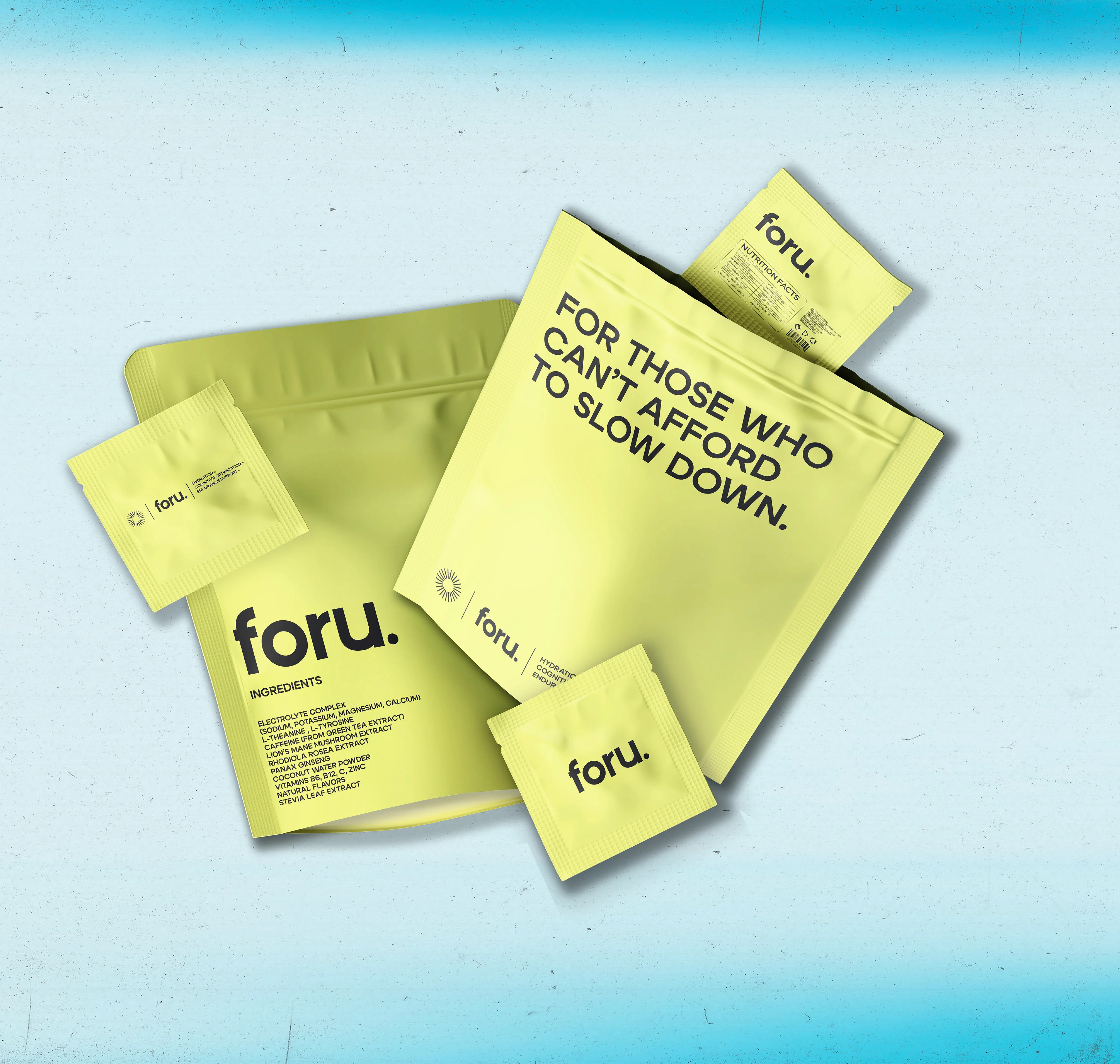
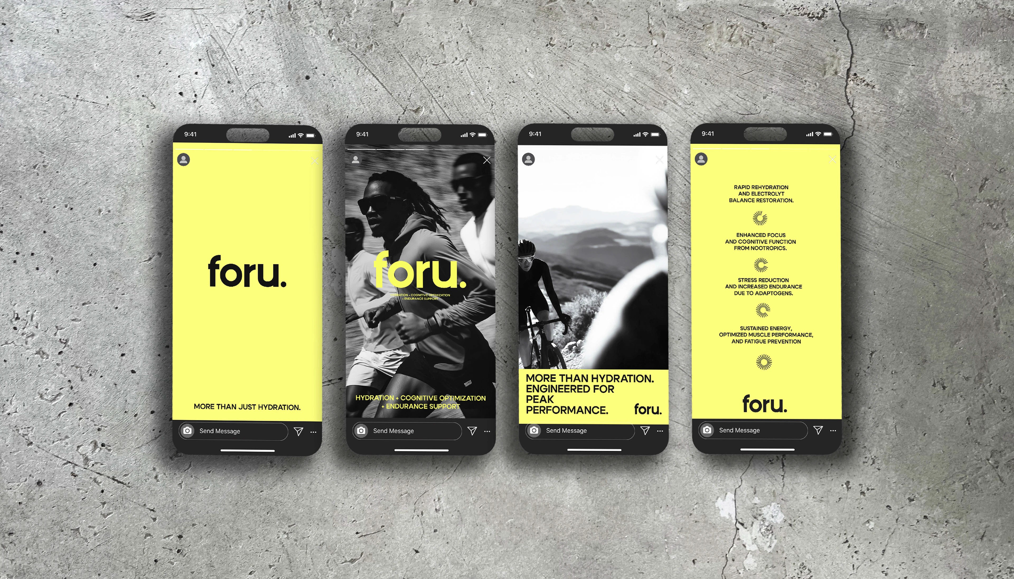
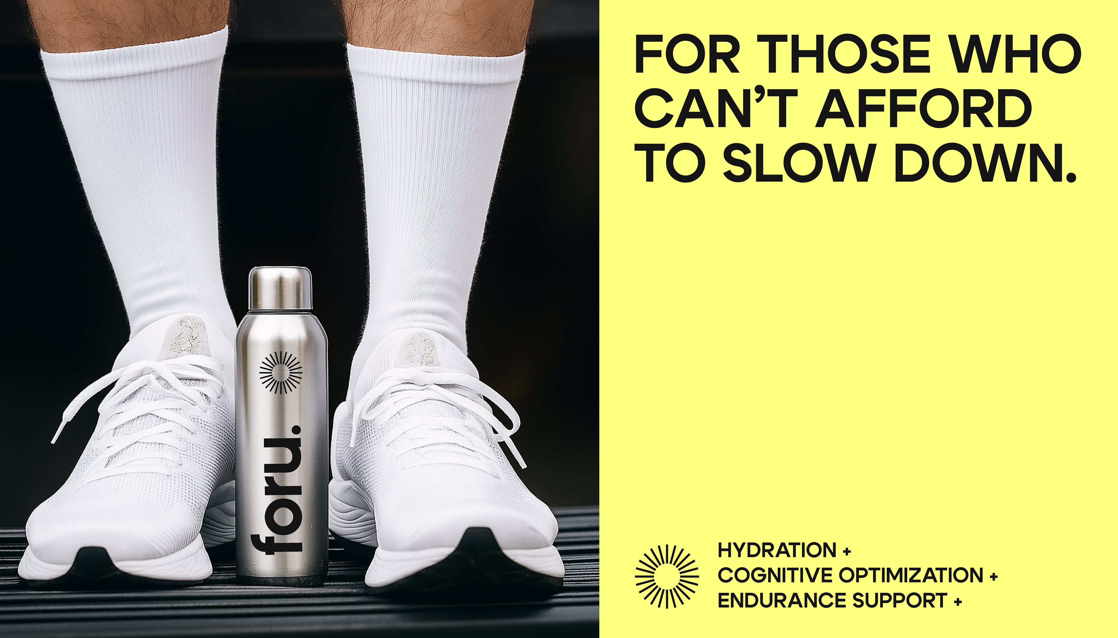
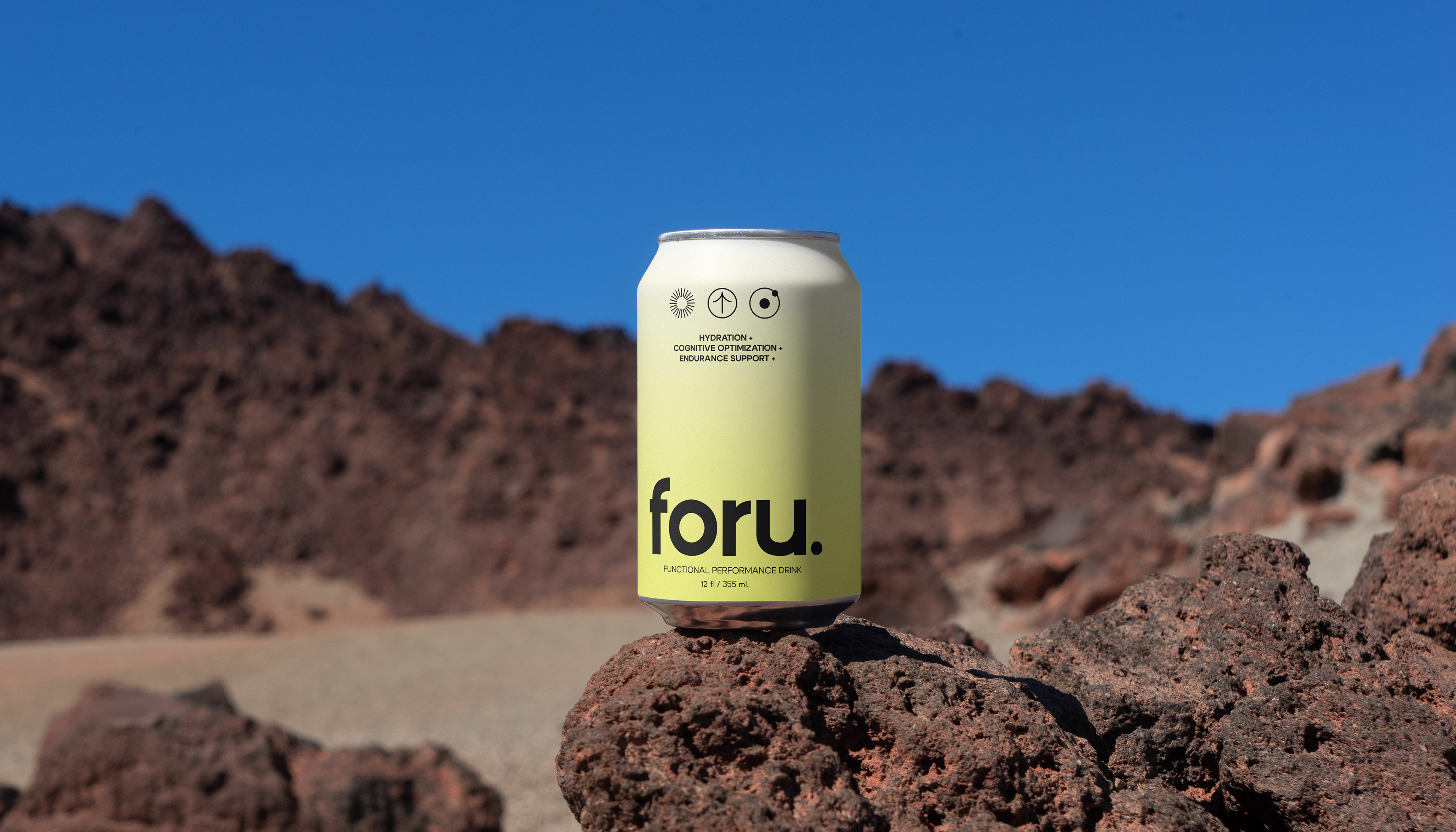
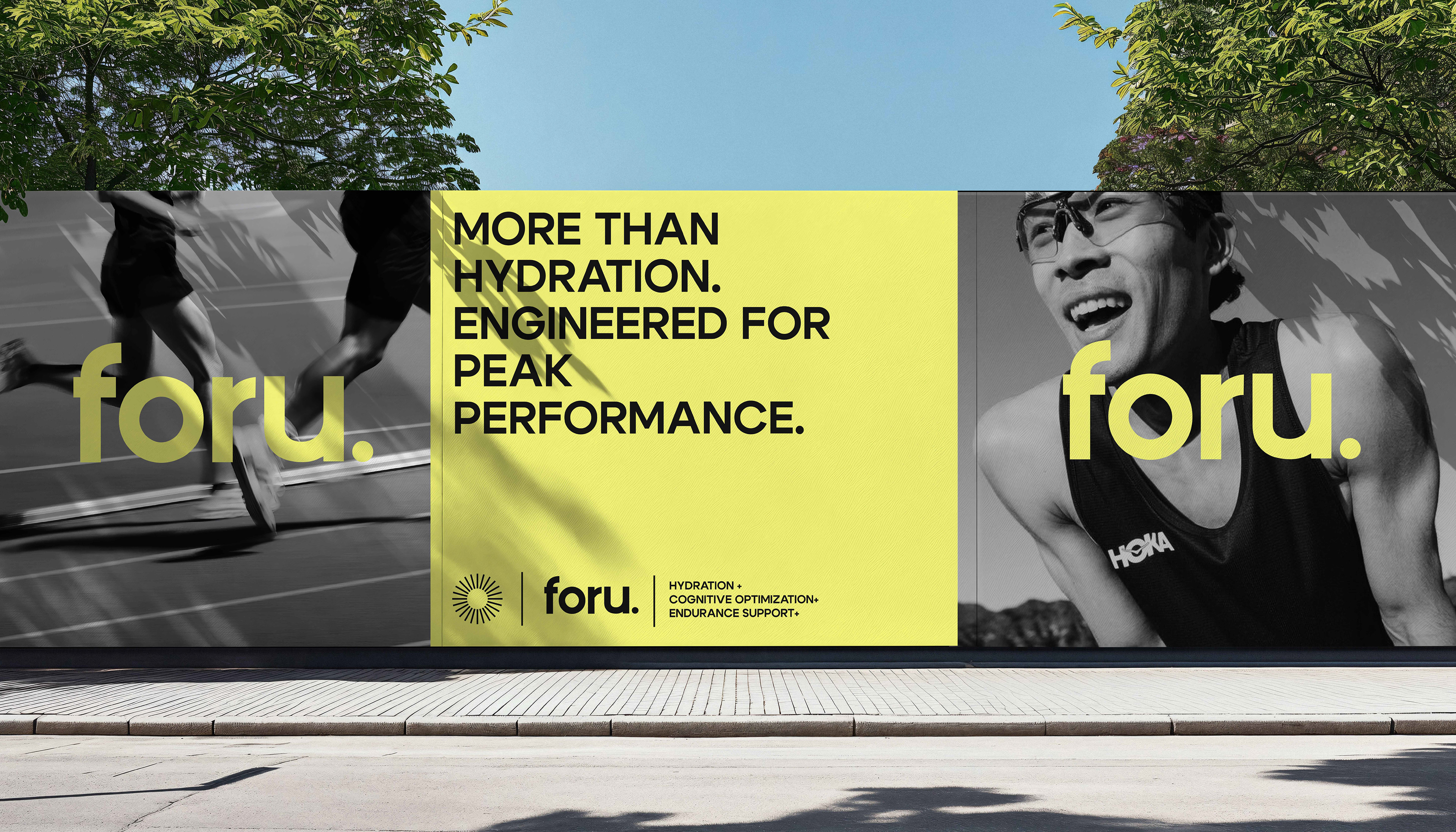
foru. is a functional hydration brand built for people who demand more from every day. Positioned at the intersection of performance, wellness, and modern lifestyle, the identity challenges the visual language of traditional sports nutrition by feeling as much like a fashion label as it does a functional beverage. The branding is rooted in bold simplicity. A vibrant signature yellow creates instant shelf recognition, while oversized typography, monochromatic photography, and clean layouts communicate confidence without unnecessary complexity. Every design decision reinforces the brand's promise of hydration, cognitive optimization, and endurance support for those who can't afford to slow down. Beyond the core identity, the system was designed to scale seamlessly across digital and physical touchpoints, including packaging, social media, outdoor advertising, merchandise, product mockups, and lifestyle applications. The result is a cohesive visual language that feels energetic, premium